How to create A+ content (EBC) on Amazon to improve your listings? Chris Rawlings from Sophie Society shares an A+ content formula for your Amazon listings that you can implement right away.
List of topics covered in the video:
01:30 Introduction
03:54 A+ content data and how does it work
06:34 What is A+ content?
08:04 The goal of A+ content
08:25 The EBC formula and which 6 elements you need to pay attention to
10:52 What images are the most effective
12:12 How to connect with a shopper emotionally
15:28 Make a customer take action on your listing
19:14 What balance should be between listing copy and images?
21:05 Creating custom graphics and banners
26:49 How does a product carousel work and how to use it
31:21 A few tips about images
34:07 Who can use A+ content?
36:00 How can Sophie Society help with creating A+ content
36:55 Adding image keywords
What is the Amazon A+ content (EBC)?
Amazon A+ content is a content that is placed in the middle of a listing, below the bullet points, title, images and frequently bought together section. It’s the content in the middle of the image that actually looks like an infographic.
The purpose of A+ content is to increase your conversions by both informing and inspiring buyers, meaning you connect emotionally with your buyers. Eventually, the end goal is to make a sale which is a byproduct of the successfully implemented previous steps. We’ll get to it right away.
Initially, only vendors had access to Amazon A+ content back in the day. Now it’s available to all sellers who have brand registry. Talking about marketplaces, it’s also available to all major markets, including European the US markets.
Data shows that Amazon A+ content can actually increase your conversion rates from 0,5% and 3%. It may not sound as huge numbers but it does have a relative difference in sales of 10% to 30% percent. Let’s say your conversion rate is at 10% and you increase it to 13%, meaning you’re actually getting 30% more sales for every 100 people that come to your listing. When it comes down to this, then you see the actual math here – your revenue is now 30% up for that one listing.
The actual A+ content formula:
- Hero image
- Story
- Interactive slideshow
- Graphics
- Banner
- Product Carousel
Amazon A+ content formula explained
1. Hero Image. The goal of the hero image is to grab your potential buyers’ attention. Usually, people will click on the listing, scan the information written at the very top of the listing (bulletpoints and images) and immediately scroll down to the very bottom to read reviews. At this point, after reading the reviews, it’s either one of the two – the buyer will decide to scroll back up or click off to another listing. It’s very important to understand and keep in mind that buyer behaviour pattern.
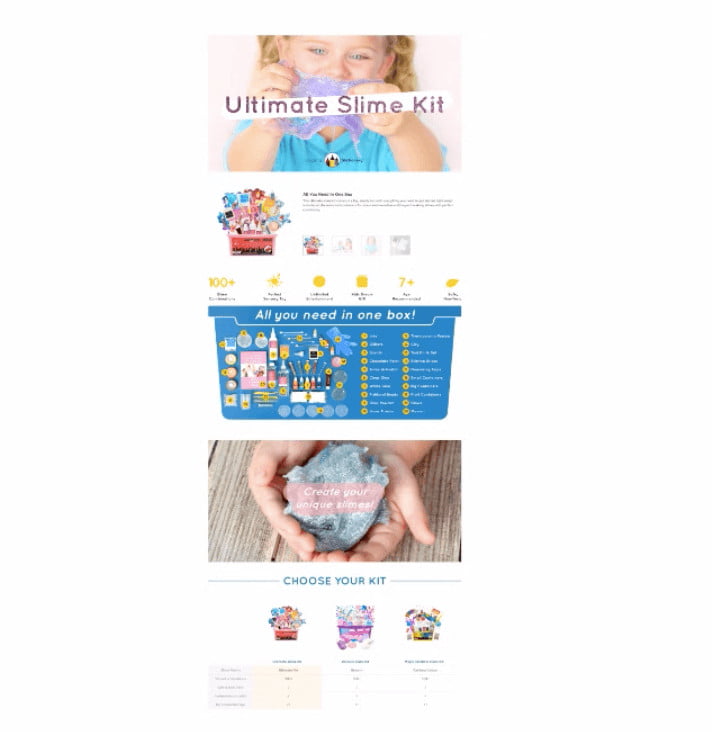
The reason why EBC is so important is that after reading the reviews and scrolling back up to the top, they now scan the listing from the bottom. That’s where EBC comes into action – since it’s placed in the middle of a listing, people will likely pay more attention to it rather than to bullet points at the very top of a listing. Hero image, in this case, is crucial to grab people’s attention so they stop scrolling their way up and concentrate on A+ content. For this reason, the image is usually a close-up – here’s an example:
At the top, you can the image is very striking – it shows a girl with slime in her hands, which is an actual product that a company sells.
2. Story. This is where you connect emotionally with a shopper. The thing is – if you are not a direct factory, you are not going to compete on price. Chris states that this part is the most important one and moves the needle the most. When it comes to your personal brand story, you differentiate yourself from others by telling your story and connect with people.
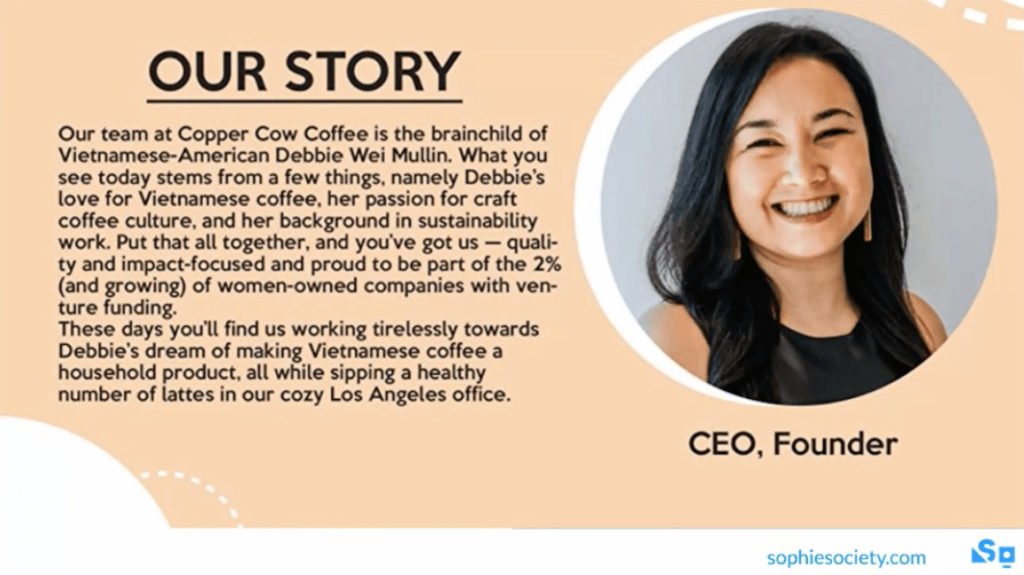
And another thing is – every brand has its own story, so don’t skip this part only because you think your story is not worth sharing. It can be either how you founded the company, how the idea of the product first came up, how your product solves one or another problem. The most important thing when creating your story is it should be person-focused instead of product-focused. It’s a fact that people trust those websites more where they see people’s faces and not the ones with fancy logos and graphics. This is one great example:
This is one of Sophie Society’s clients who sells Vietnamese coffee. As Chris reminds once again, there are a lot of options for what your individual story can be about.
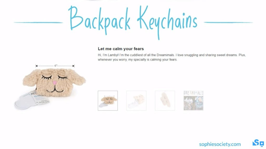
3. Slideshow. This one is actually deeply connected to human’s psychology. Using slideshow, you actually make customer to invest time in your listing and to take some sort of action.
The slideshow is a mix of text and images. To create a slideshow, you can use 4 images with thumbnails and the hover each one over.
Even though shoppers might not realize it, by creating such slideshow you invite a person to act on your listing in order to get more information about a product. Doing so makes it one step closer to make a buying decision.
It’s worth mentioning that the whole EBC idea is all about visuals. You would want to communicate as much as possible using visuals and remove any excessive texts. So remember – the visuals tell the story, the texts just support it.
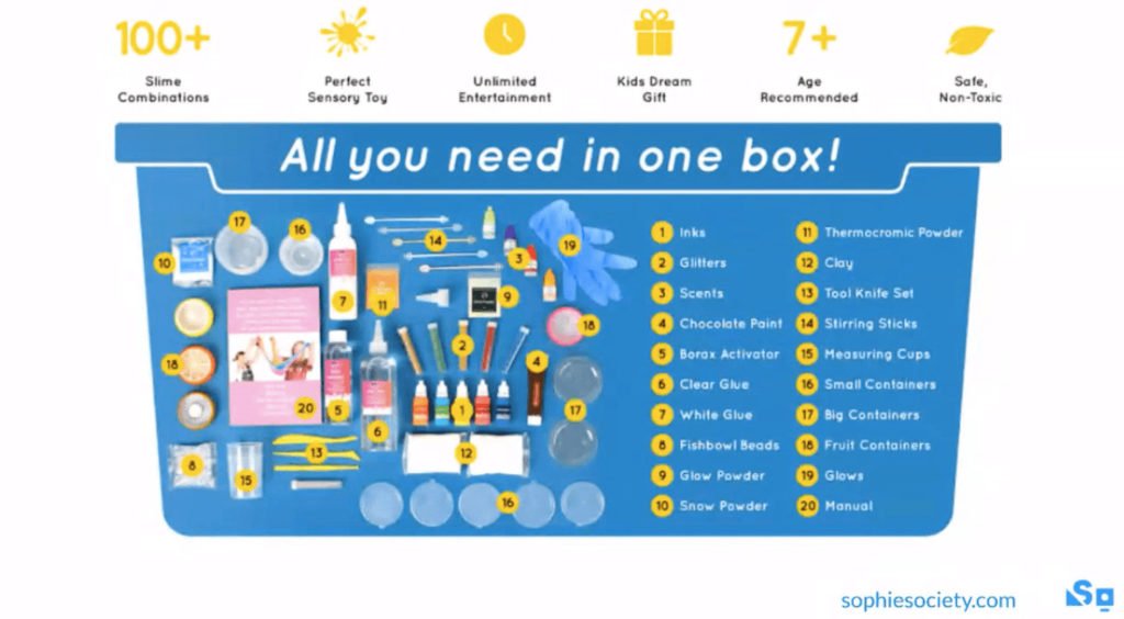
4. Graphics. By creating custom graphics, you create yourself a chance to tell about your product as much as possible. For example, here is a graphic that was custom made for a company that sells toys:
The goal of this graphic is to show what elements the kit includes. If you are not experienced in creating this kind of designs, don’t worry – you can always make a sketch of how you imagine it should look like and outsource it to be done by a graphic designer.
Also, don’t be afraid to be creative. In the example above we can see the text is put inside the graphic which is in most cases might be scary for Amazon sellers to do the same thing. Usually, we put text next to the images and not inside, so, actually, EBC content lets you be more creative than Amazon is actually telling you.
5. Banner. Similarly to hero image, banners are also supposed to grab buyers’ attention:
The most important thing is to make it simple, do not overuse text information and use only relevant elements to represent your product, which is, in this case, dog food.
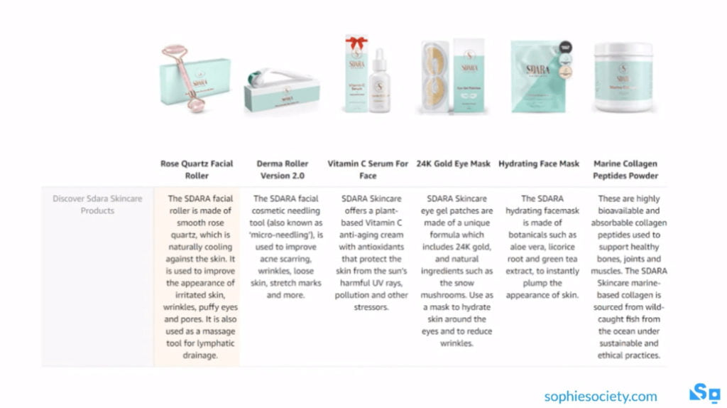
6. Product Carousel. This is where the selling happens. Besides the story, it’s the second strongest part of your A+ content.
Amazon is stealing real estate from your listing all the time since they want buyers to click off your listing to explore a different variety of other products. As a seller, you don’t want this to happen and so a product carousel is your way to reclaim the real estate back and cross-sell your other products.
Most sellers do not create such carousels as shown in the example because they are afraid they can’t use the product carousel when products are different from each other. The truth is, you can do so – you can use the product carousel even if your products are not from the same line.
You can see these products above are completely different and the only thing that connects it is the same brand. You won’t be able to make a comparison table using different products but what you can do is creating a mini listing where you put the image (tip: you can use a different image here from the one you use for your main listing), title and a short description. All products are clickable and inside of each of these listings, you can have A+ content ready to cross-sell your own products instead of Amazon efforts to use your real estate to promote competitors’ products.
So, to sum up, here’s a few additional tips:
- If possible, use your own images, if not – don’t be afraid to use stock images, such as Pixabay.
- Big specialty graphics are great
- Don’t forget, it’s all about images – the better quality, the better EBC.
About Chris Rawlings
With brands reaching out to him for help in figuring out the highly competitive Amazon landscape, Chris Rawlings facilitated over 1,500 product launches and listing optimization while helping over 400 companies dominate Amazon’s US, EU, and Japan markets, which lead to the founding of Sophie Society in 2019. Sophie is an Amazon service provider built on scientific principles and truth-finding via a constant feedback loop


